

by Duke Okes
Everyone is overloaded with information in today’s world and it’s no different inside organizations. One way to help people quickly understand the status of the organization is to provide graphic displays of key performance indicators (KPIs), typically covering the areas of financial, marketplace, customer, and operations performance at the top level, supported by process or department-specific metrics aligned with the KPIs.
Audit managers typically apply a similar concept to internal indicators. Indicators such as the following are often used to show the status of the audit function:
- Percent of audits conducted on-time
- Number of nonconformities per audit hour or day (sometimes broken into major vs. minor nonconformities)
- Timeliness of corrective actions
- Percent of active auditors (defined as having participated in at least one of the last x audits)
- Number of auditors and their levels of qualification (e.g., co-auditor only, audit alone, lead auditor)
Another valuable audit dashboard is one that indicates the current status of the management system. It would show the results of the most recent audit for each area of the organization, such as department, International Organization for Standardization (ISO) element, and/or process.
Figure 1: Internal audit dashboard: Matrix format audit dashboard
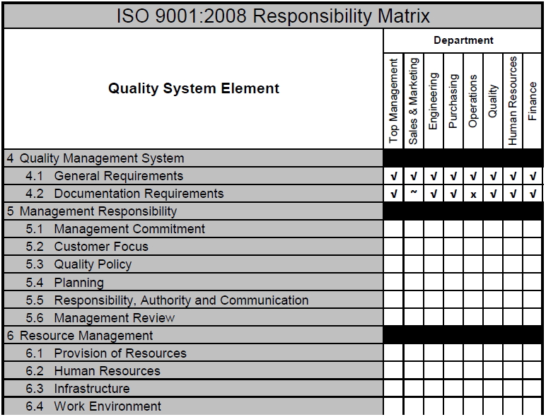
Figure 1 shows a partial example of one such format. It’s a responsibility matrix often used when implementing a new management system, in which the intersection of department and ISO element is marked to indicate level of responsibility. In this case, it has been converted for use as a system performance internal audit dashboard and has been partially completed for elements 4.1 and 4.2. A checkmark indicates no nonconformities, a tilde (~) indicates minor issues, and an x indicates significant problems. The substitution of the colors green, yellow, and red, respectively, would make interpretation of such a document very easy, pointing out differences in performance of portions of the management system and/or of the organization.
Figure 2: Internal audit dashboard: Process format audit dashboard
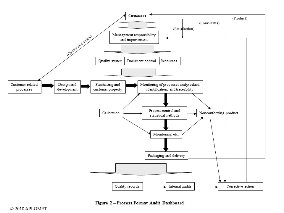
Figure 2 shows another potential way to display the information in a way that’s more appropriate for process thinking. The diagram indicates the flow of processes within the management system. Performance of each process could again be shown by coding each process green, yellow, or red. For those organizations that have documented “a description of the interaction between the processes of the quality management system” (ISO 9001:2008, 4.2.2. c) using process maps, such a methodology should be simple to implement.
About the author
Duke Okes is a knowledge architect who provides guidance for management system design, assessment of those systems through metrics and audits, and the use of root cause analysis to address performance issues. He’s an ASQ fellow and author of Root Cause Analysis: The Core of Problem Solving and Corrective Action (ASQ Quality Press, 2009). He can be reached at www.aplomet.com.
Tags: internal audit dashboard, matrix format audit dashboard, process format audit dashboard.